Redefining the future for a national icon by leaning on its past.

Bonsoy
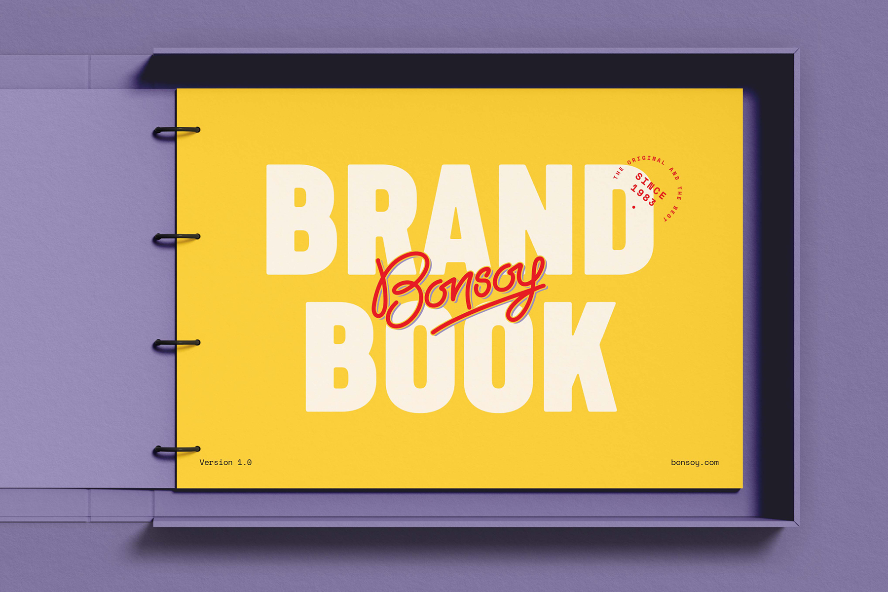
Brand Identity
- Brand Strategy
- Brand Identity
- Verbal Branding
- Digital & Print Design
Finding Bonjoy™
After being at the forefront of plant based liquid foods in the 1980s, Bonsoy has developed into a household name and its distinctive yellow packaging is now etched in the minds of many Australians. Perched in a café next to the coffee machine or on the shelves of the major supermarkets, Bonsoy is the market leader. While the brand itself had some iconic features; it lacked visual cohesion, structure and language that told the Bonsoy story.
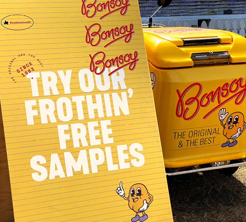
We went back to the drawing board and engaged in a strategic process to define a brand position, restructure the product offering and understand what makes Bonsoy truly special. During this process it was apparent that the cult following of Bonsoy was undeniable. This was truly a brand steeped in culture which had been largely created by the people who drink it. These devotees are uncompromising in their pursuit of quality and get an adreneline rush when they see their café wall lined in those iconic yellow boxes. We call the feeling Bonjoy™.
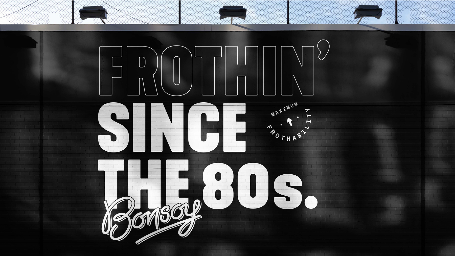
The original 80s kid
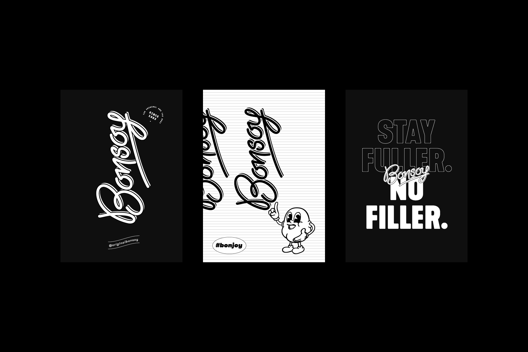
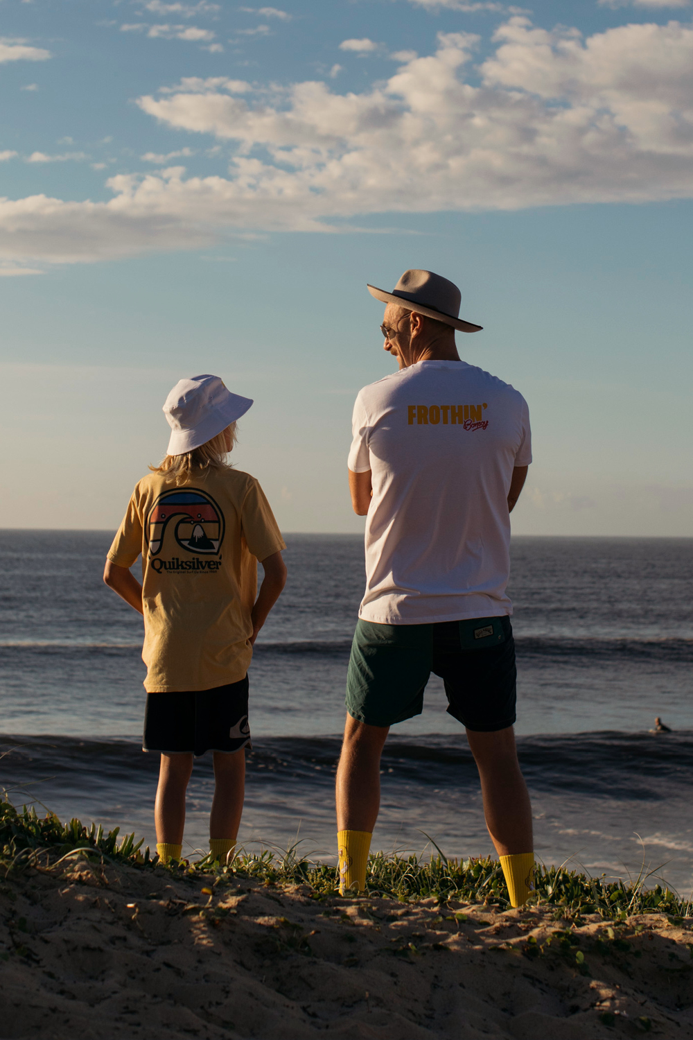
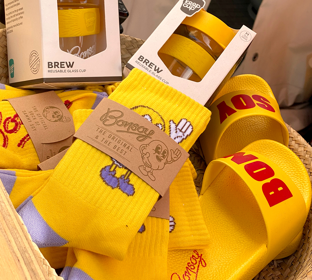
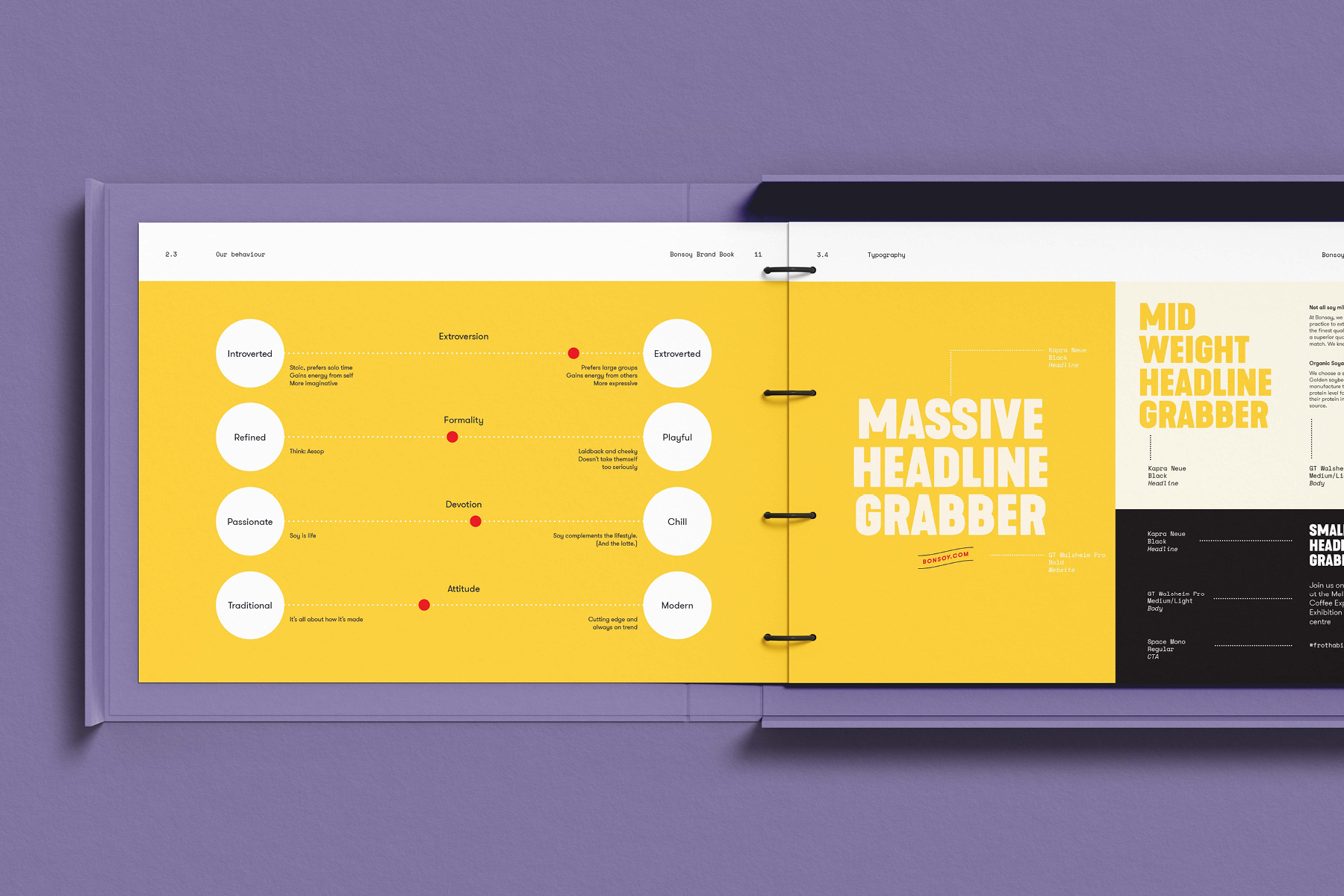
Bonsoy has a unique cult following…we’re talking tattoos on the keenest devotee’s skin, YouTube tutorials on how to make a wallet from a carton and coffee lovers unwilling to have any other soy in their latte. As a result we inherited the challenge of growing and evolving Bonsoy without alienating those who are attached to the grassroots origins of the brand. With an iconic brandmark, colour and packaging, we set ourselves the task of building a dynamic verbal and visual brand system that takes Bonsoy into the future while ensuring the past comes along for the ride.
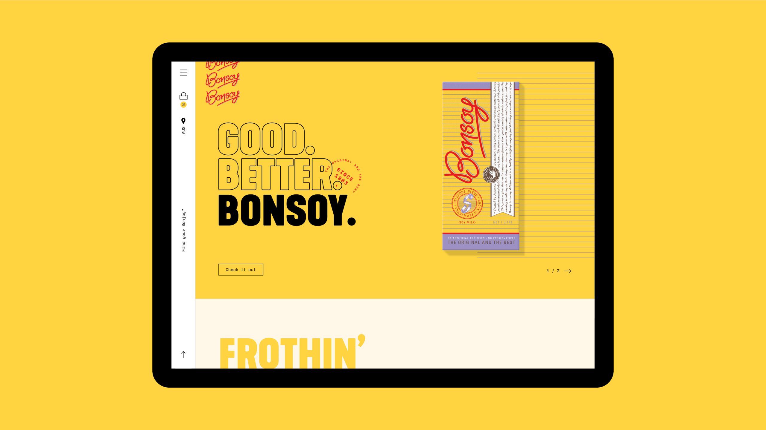
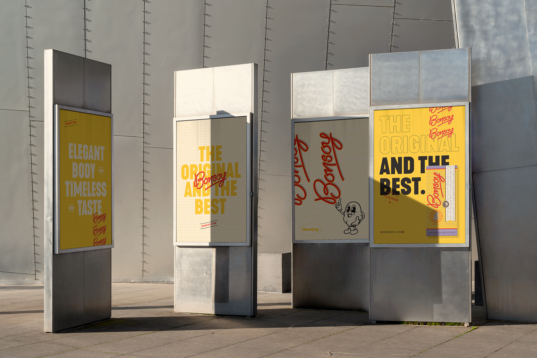
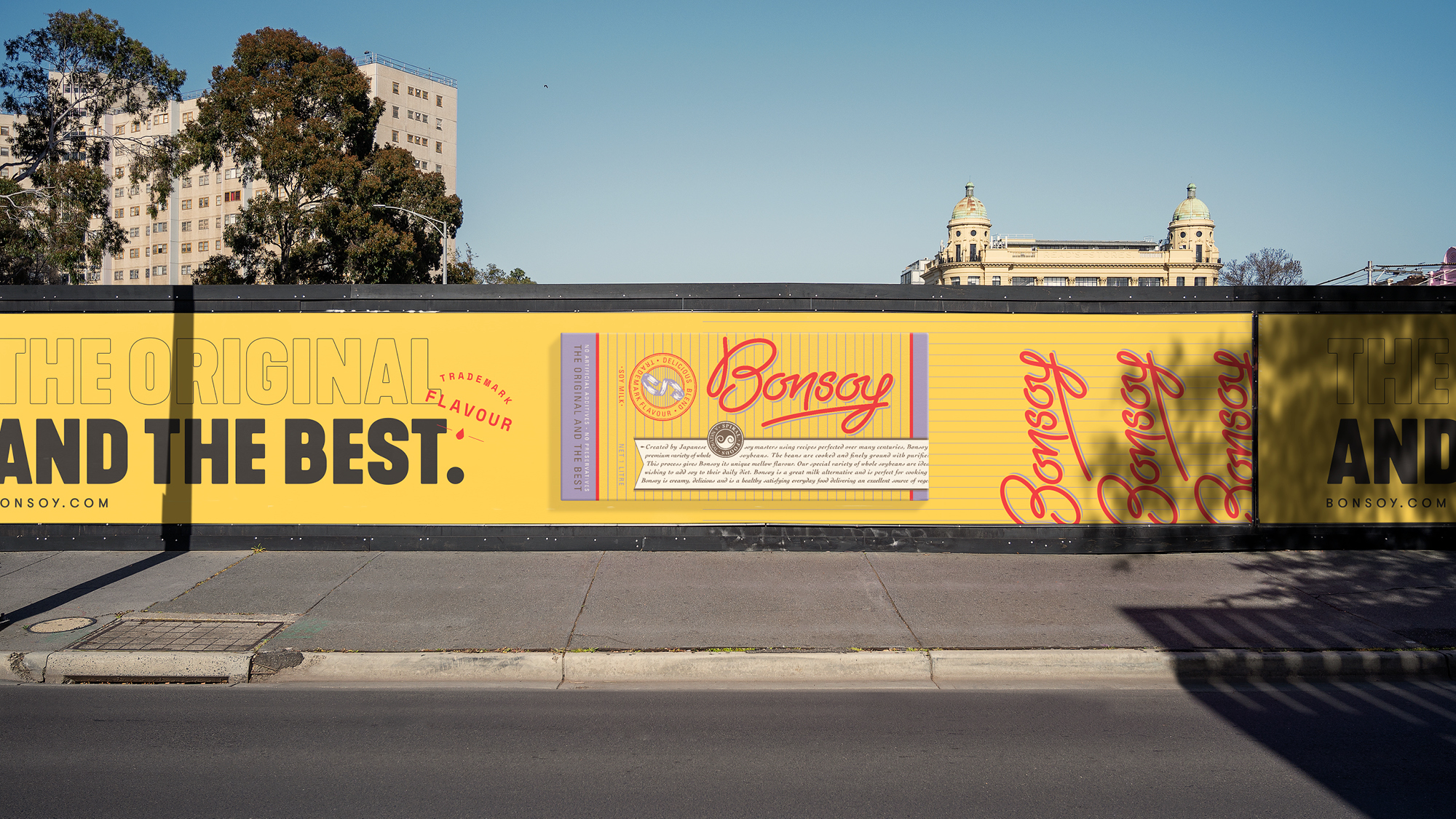
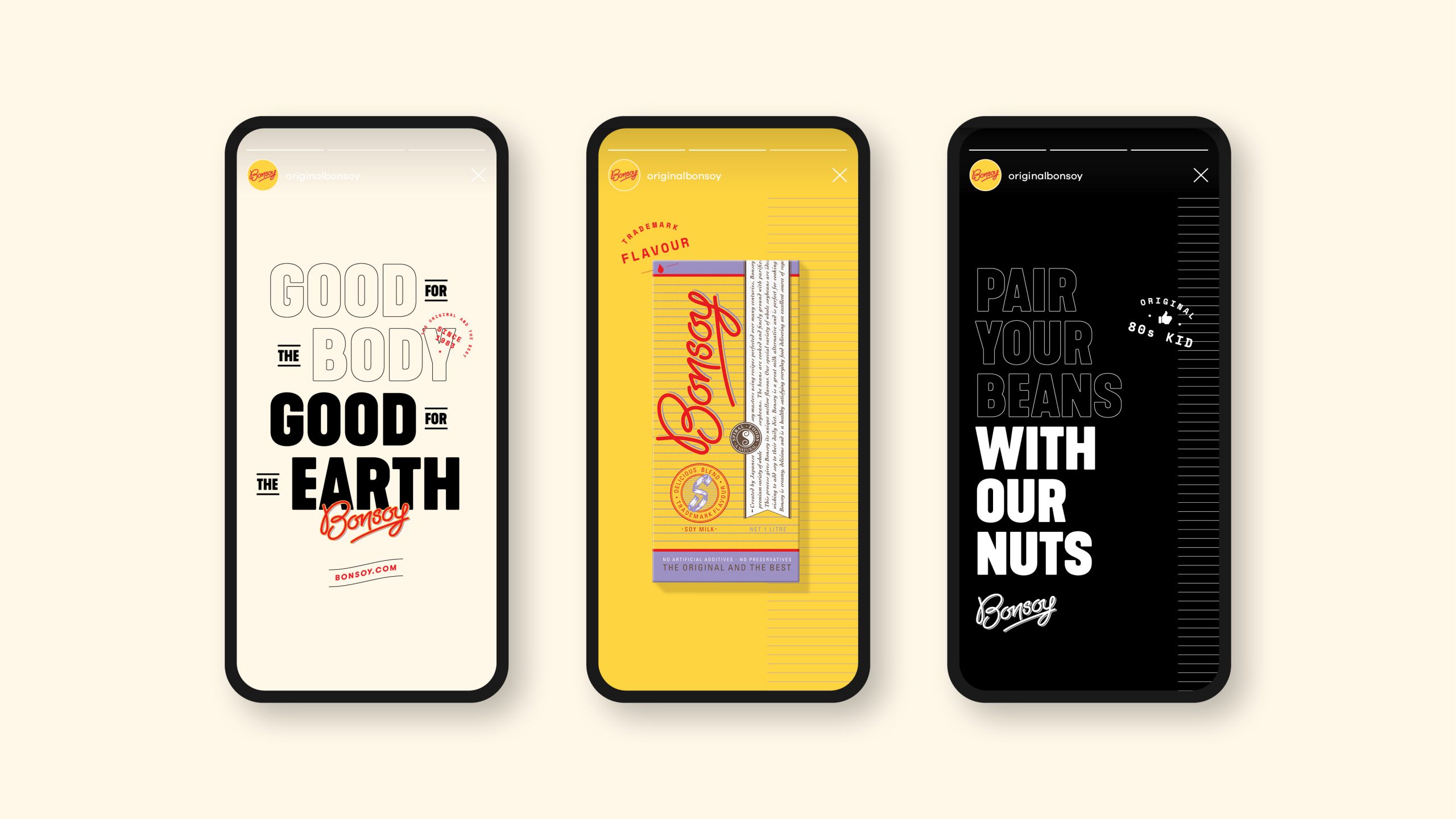
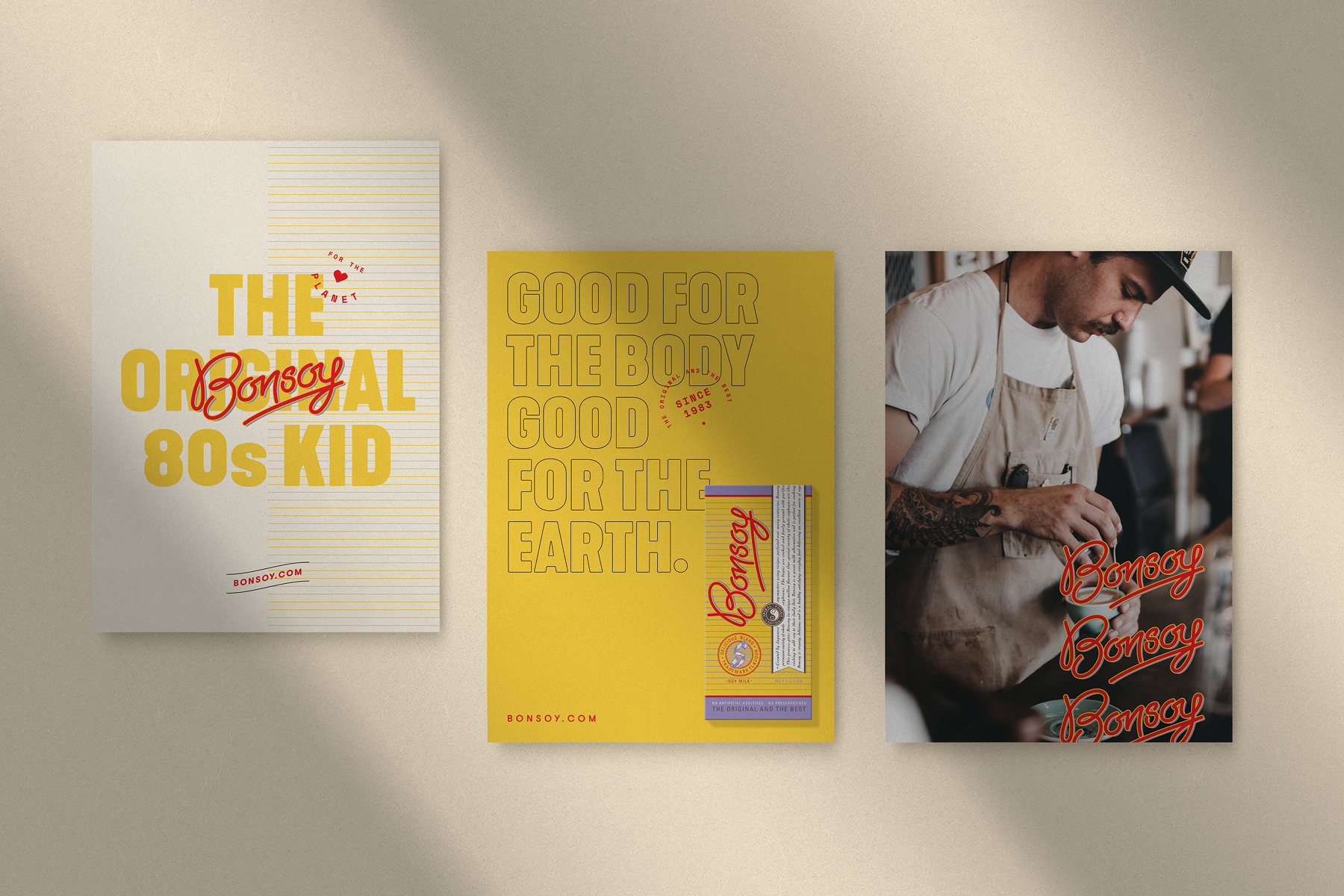
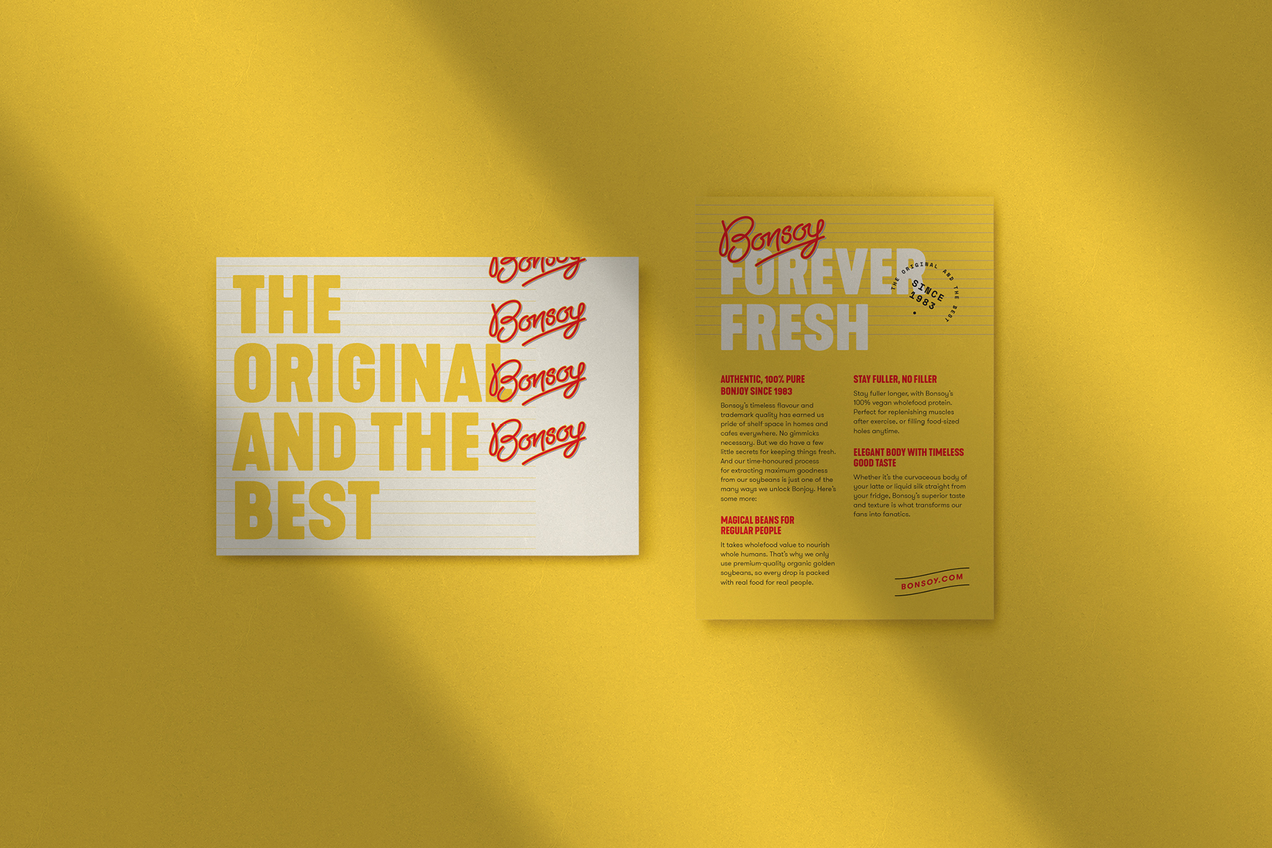
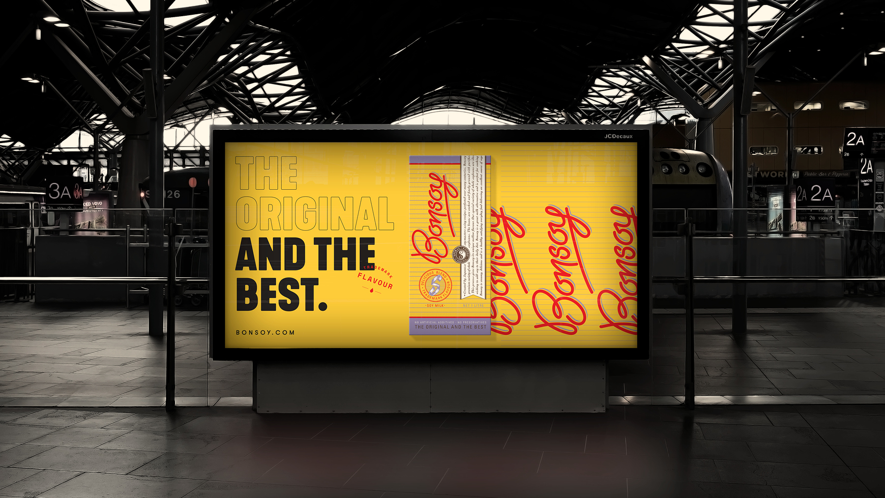
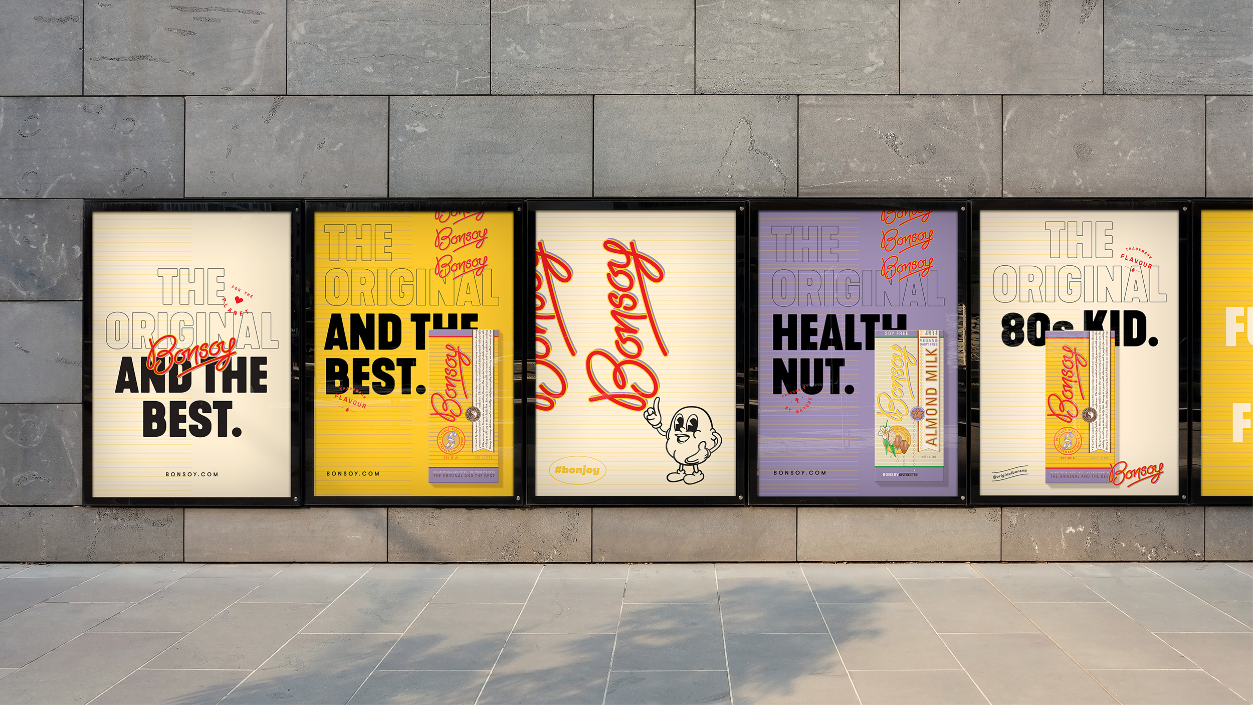
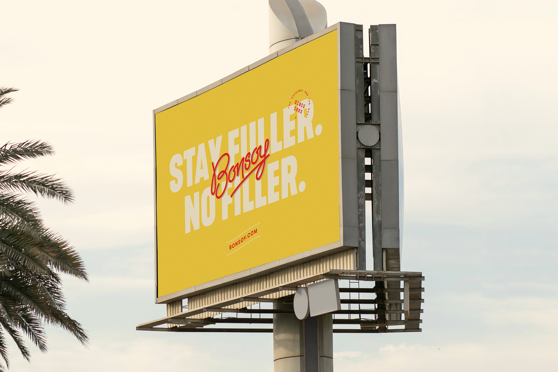
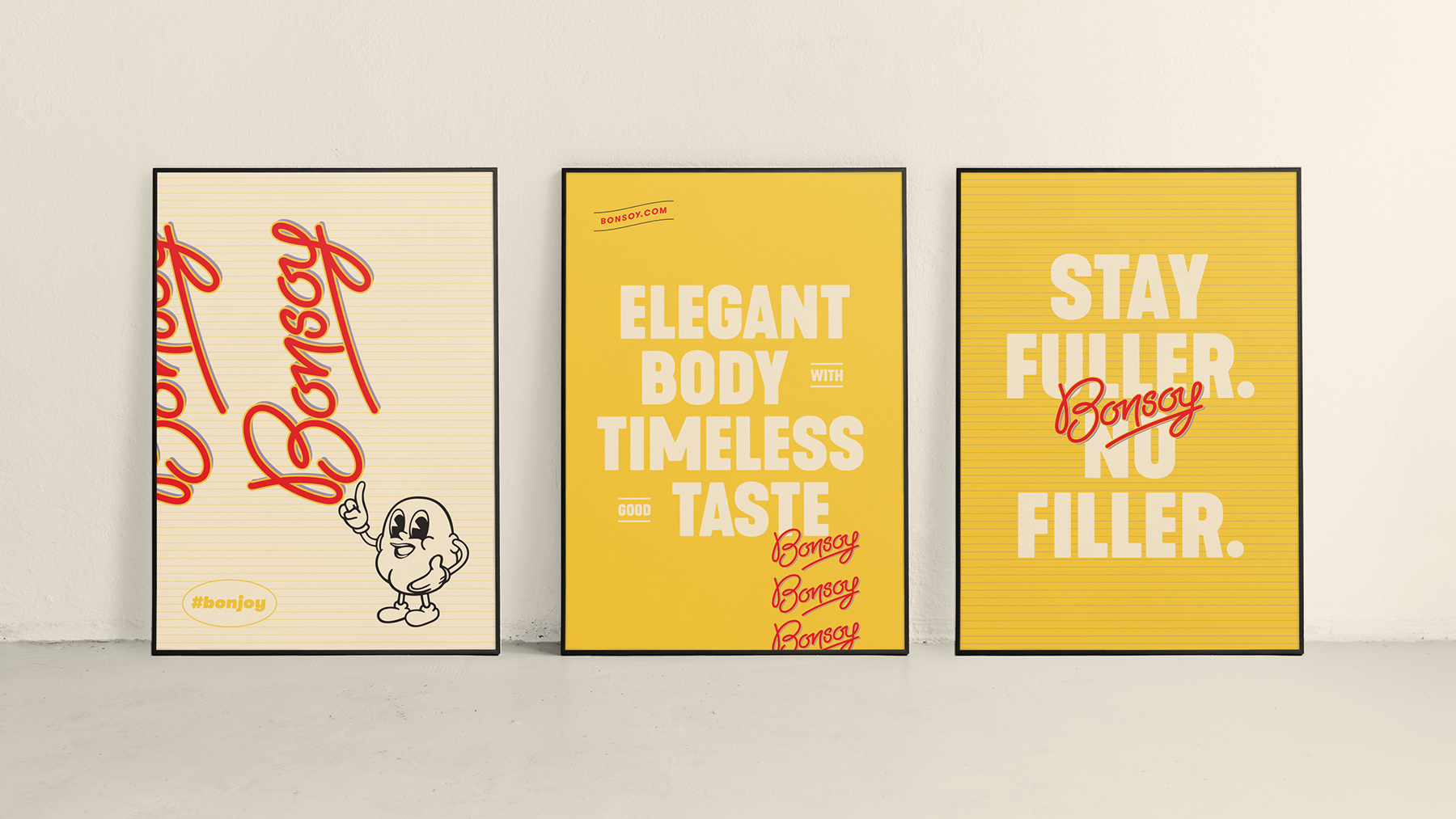
Good. Better. Bonsoy.
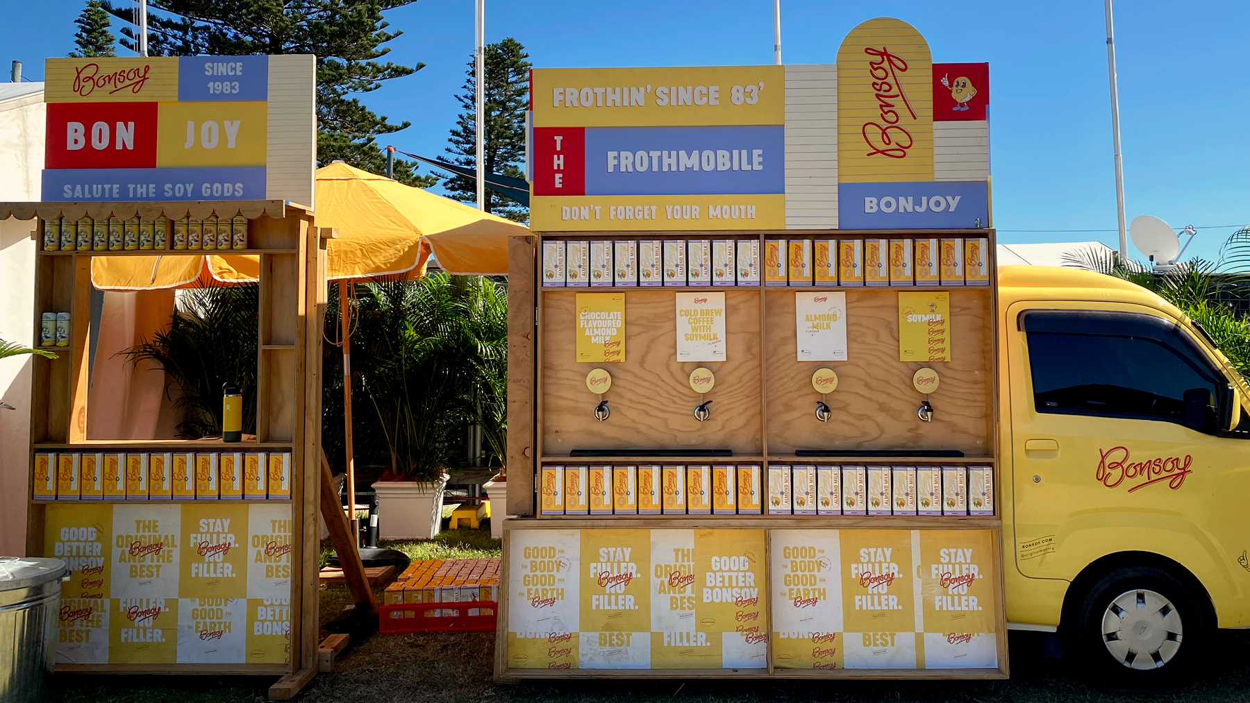
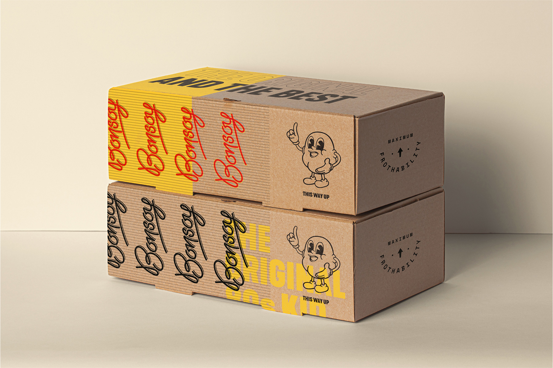
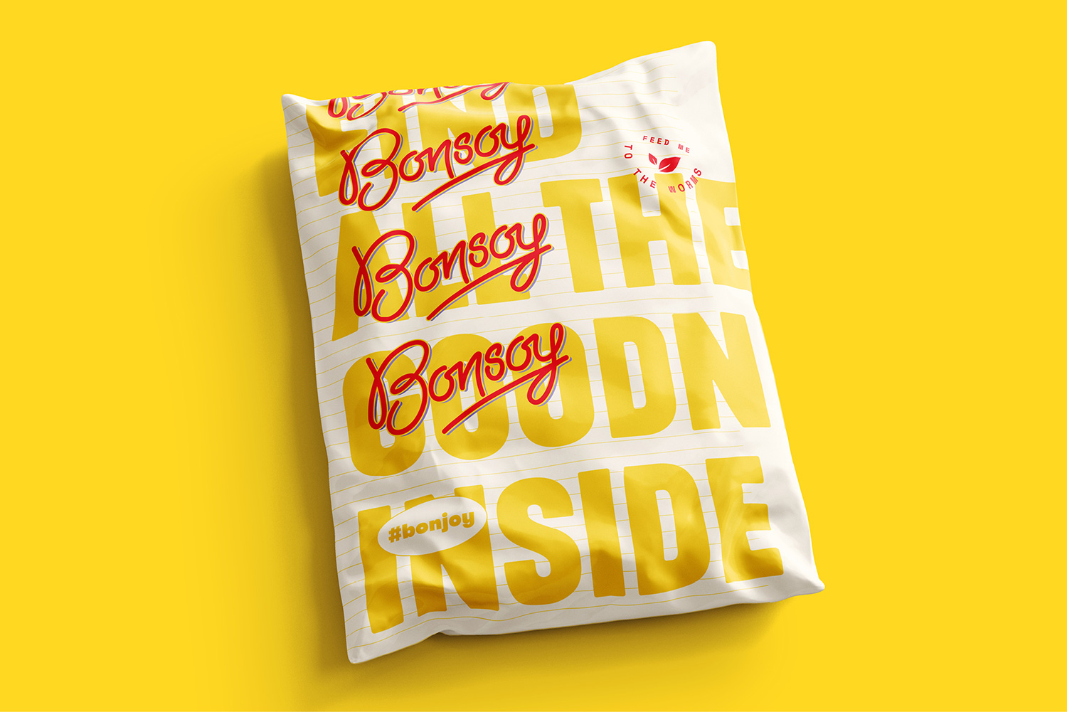
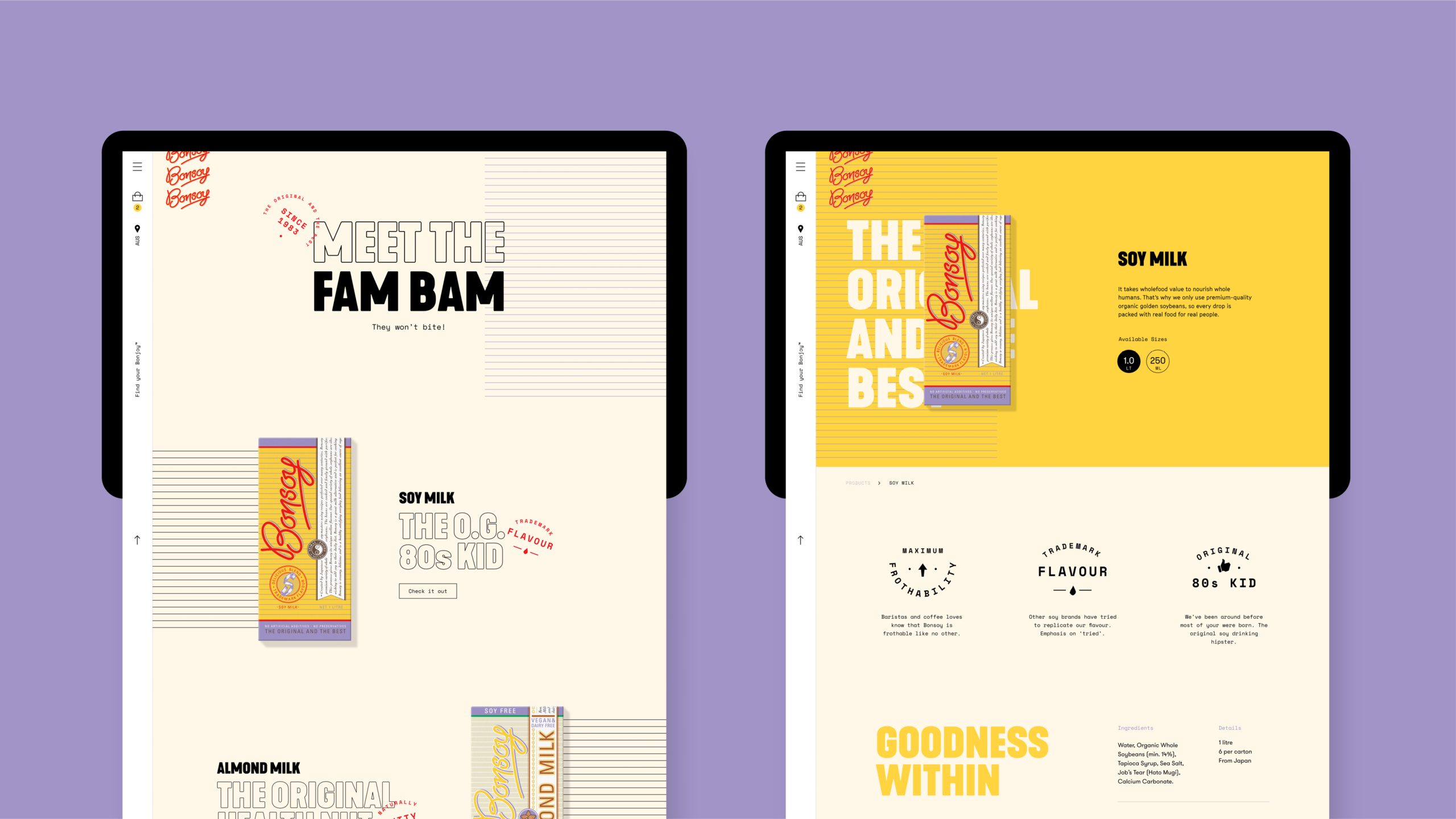
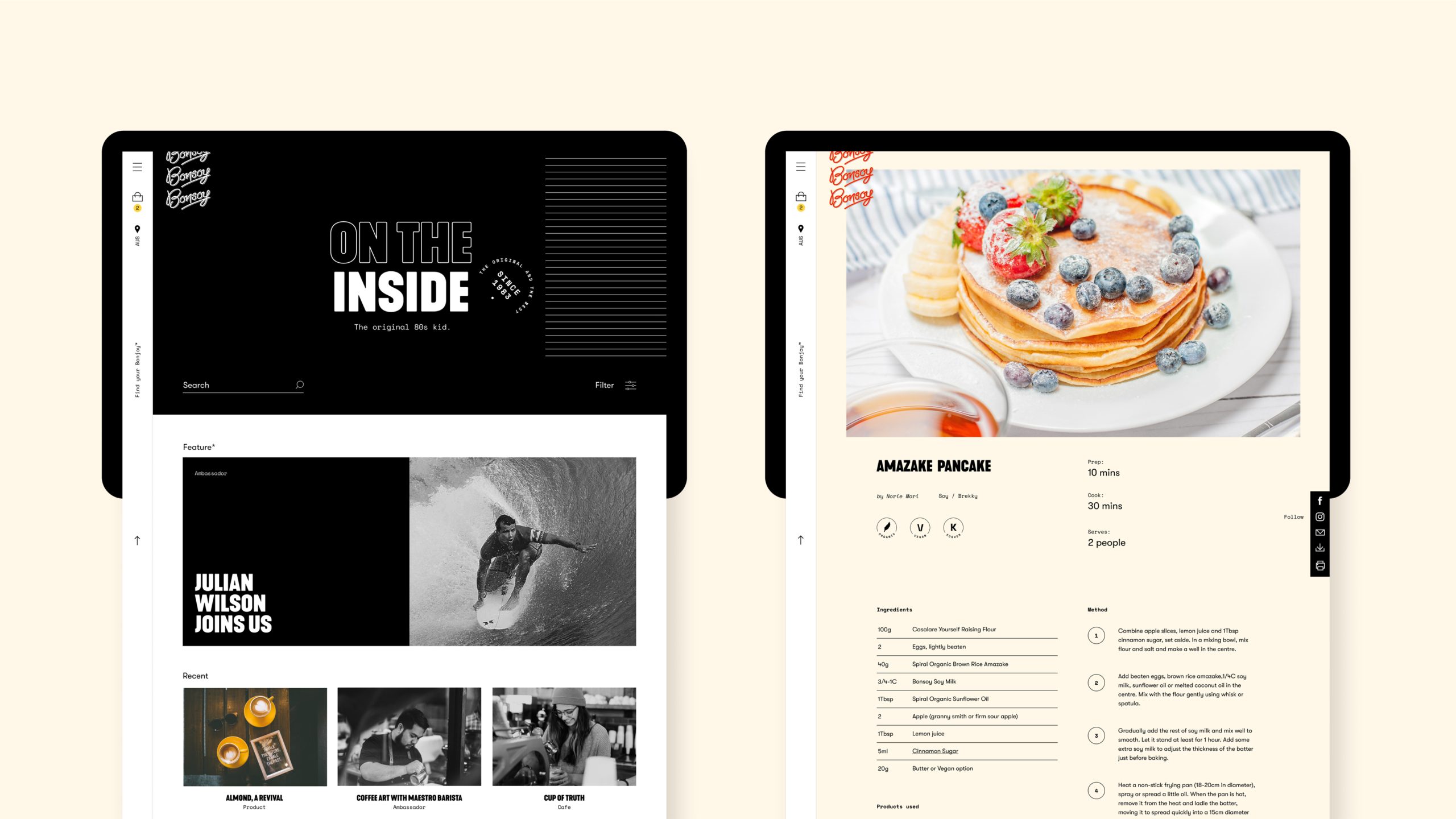
Subtle but powerful, we changed the angle of the horizontal brandmark itself while creating a patterned variation which captures the repeated brandmark on the boxes when stacked on a shelf. Bonsoy’s personality was captured through a selection of typefaces that provide flexibility and offer some pizzazz to the brand. Collaborating with Apostrophe copywriters we built a brand personality and tone of voice that exudes Bonsoy’s quality, captures its irreverence and cultivates a following where alternative milk-drinkers feel at home. We keep it real but keep it interesting. We say things like “pair your beans with our nuts” and “maximum frothability”.
Traditional milk: prepare for udder defeat
With an already successful and established soy product, Bonsoy has wider plans to expand its product range into a number of alternative milk products, including recent forays into almond and coconut. As a result the brand identity had to be flexible enough to cater for any future growth through new products. We built a colour palette complementary to the bold yellow and paired this with a unique icon set the path to building a suite of products.